
Printing Images in Line
You can display multiple images in a row and automatically wrap them to the next line when space runs out.
This is achieved using:
- **Dynamic Image**
- **DIV Container**
- **Block Repetition**
-
custom CSS (
inline-block)
How it works
By default, elements are rendered as block, meaning each item appears on a new line.
To display images side by side:
- wrap each image in a **DIV Container**
-
set the container's display to
inline-block - repeat the container using **Block Repetition**
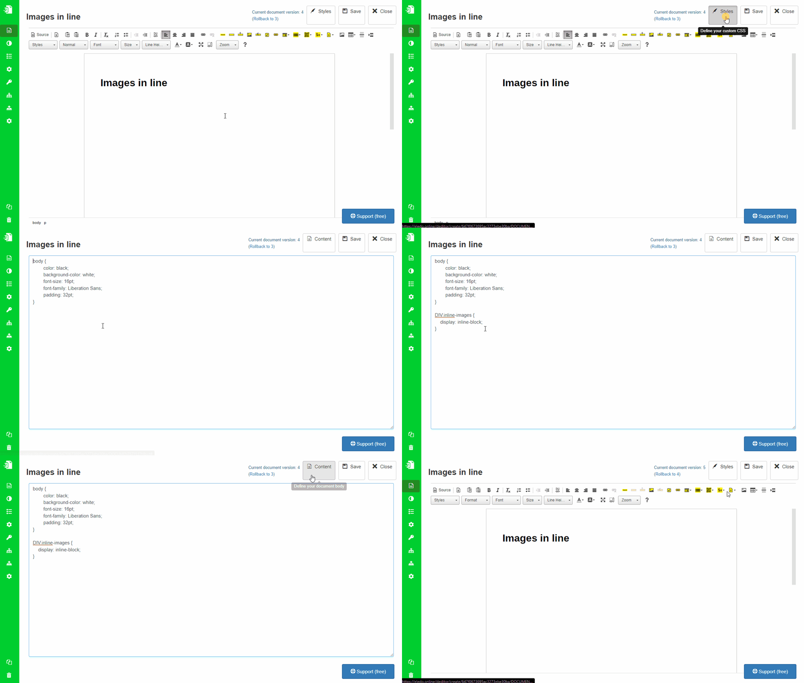
Step 1: Define custom style
Add a style for the DIV container:
div.inline-images {
    display: inline-block;
}
This allows multiple containers to sit next to each other and wrap automatically.
Add this style in Styles Mode.
Step 2: Add Dynamic Image
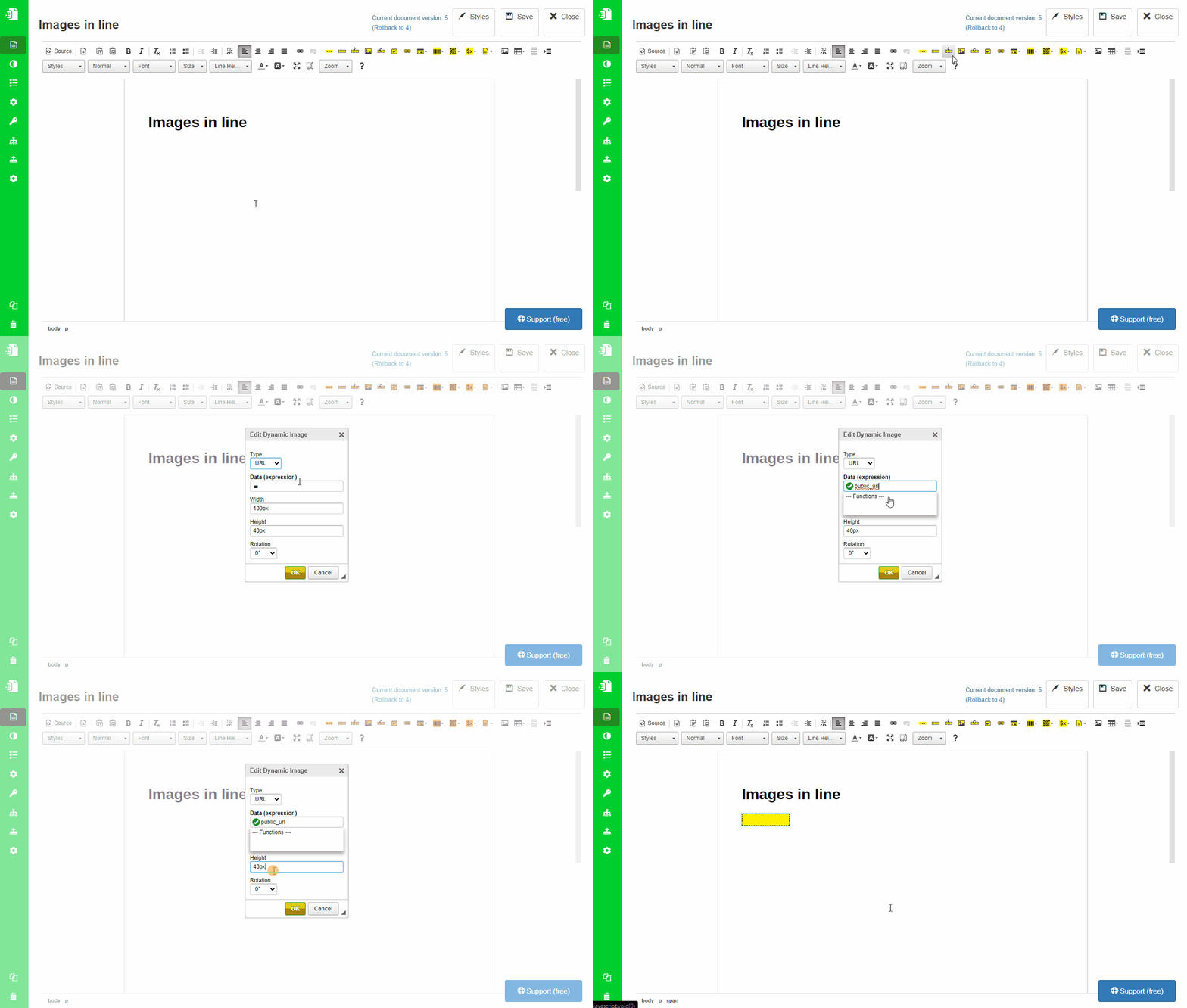
Insert a **Dynamic Image** component.
Use a field that contains a publicly accessible image URL.
Example:
public_url
Remove the height (or width) to preserve aspect ratio.
Step 3: Wrap with DIV container
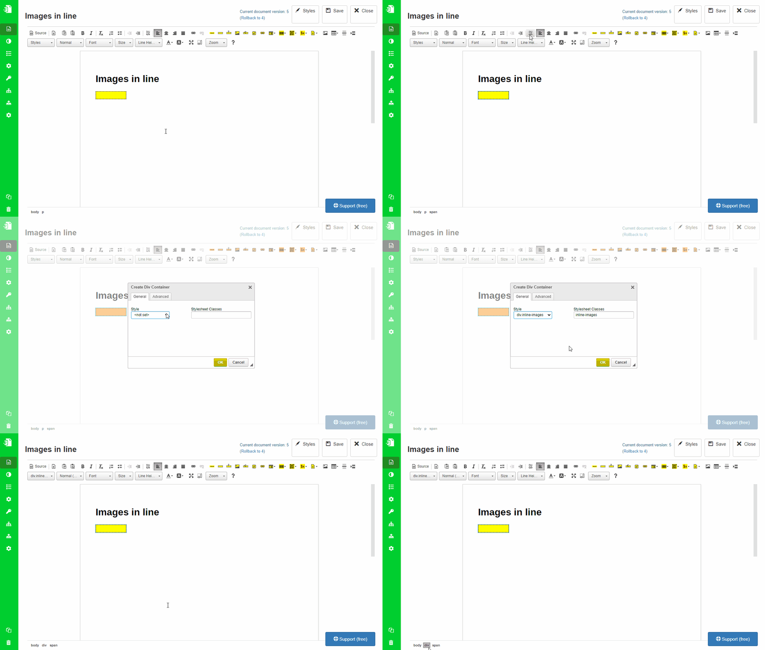
Select the Dynamic Image and wrap it using **Create DIV Container**.
- This replaces the default paragraph (
<p>) container - Assign the
inline-imagesclass
You can verify the structure in the editor’s component path (bottom bar).
Step 4: Apply Block Repetition
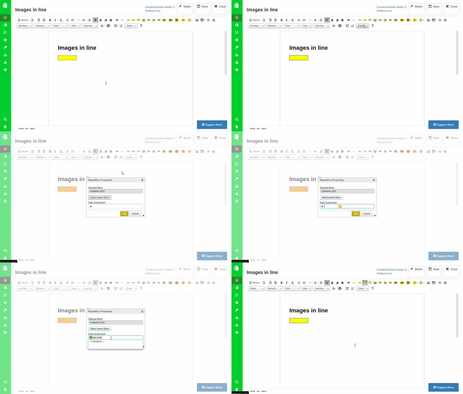
Apply **Block Repetition** to the DIV container.
This repeats the container for each image in your list.
Result
Images are displayed in a row and automatically wrap to the next line.
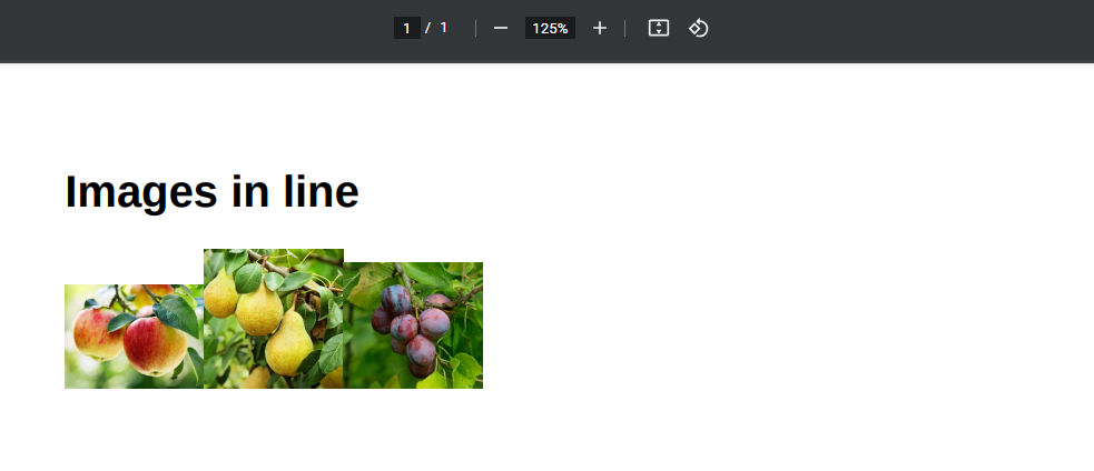
Improvements
Add spacing
Update the style:
div.inline-images {
    display: inline-block;
    margin: 6pt;
}
Normalize image size
Set a fixed height for images (e.g. 100px) to improve alignment.
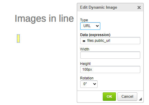
Final result
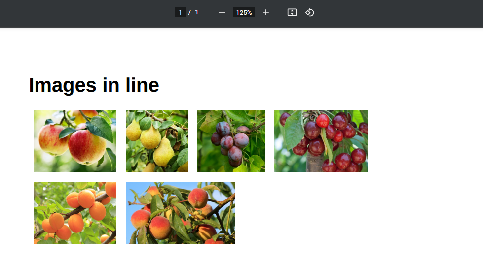
Important notes
- Images must be accessible via public URL
- Layout depends on CSS — adjust styles as needed
- Mixed image sizes may affect alignment
Related topics
- Images → Dynamic Image
- Layout → Create Div Container
- Repetition → Block Repetition
- Styling → Styles Mode
Was this article helpful?
Yes
No

